fight scene (dam it i hate calling them that)
Moderators: Admin, Moderator Team
-
chrisgreen
- Posting Freak

- Posts: 218
- Joined: Thu Oct 09, 2003 2:15 pm
- Location: Bury St. edmunds
- Contact:

Thanks man. I just did that one as a tribute to Retro looking things. I love that art form, its really amazing what people do with it. Im actually designing or sorry enhancing my other logo. Tell me what you think.
**EDIT** Switched text on top.
**EDIT** Switched text on top.
Last edited by KeithP on Tue Sep 19, 2006 10:52 pm, edited 1 time in total.
-
chrisgreen
- Posting Freak
- Posts: 218
- Joined: Thu Oct 09, 2003 2:15 pm
- Location: Bury St. edmunds
- Contact:

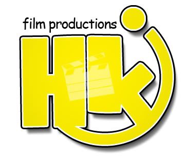
Hey Chris thats a nice logo. Just switch the text to something else and make "New Cinema" on just one line. www.dafont.com has real cool texts. I would show you what I mean but I don't want to copyright your work. So with your permission I can show you some sweet texts I think would work. Add a black outline if there is not one already since the forum is black. Haha. Oh just to add the one on the left isn't my real logo. Its just something I did to make retro. Heres the real logo. Both are still in the works.

If anyones got any suggestions let me know. PS I love how we took over Rhys's post.
If anyones got any suggestions let me know. PS I love how we took over Rhys's post.
-
UFProductions
- Forum Veteran

- Posts: 1479
- Joined: Sun Apr 18, 2004 5:12 am
- Location: Calgary, Alberta, Canada
OMG, you've just thrown me into an existentialist-filmmaking crisis Keith! I have no logo! I suddenly feel disillusioned with my life! I'm also using internet abbreviations! And exclamation points!
I'm digging the retro logo though, especially the one with the starburst in your avatar. For some reason though it just screams communism to me! Very Hammer & Sickle-esque. The closest I've ever really come to making a logo can be seen at the beginning of this. The little bit with my name and "Under Fire Productions".
I'm digging the retro logo though, especially the one with the starburst in your avatar. For some reason though it just screams communism to me! Very Hammer & Sickle-esque. The closest I've ever really come to making a logo can be seen at the beginning of this. The little bit with my name and "Under Fire Productions".
Losing consciousness,
in the arms of an angel,
I find only peace.
in the arms of an angel,
I find only peace.
-
UFProductions
- Forum Veteran
- Posts: 1479
- Joined: Sun Apr 18, 2004 5:12 am
- Location: Calgary, Alberta, Canada
-
chrisgreen
- Posting Freak
- Posts: 218
- Joined: Thu Oct 09, 2003 2:15 pm
- Location: Bury St. edmunds
- Contact:
Sorry about the off topic-ness aspect of these posts, but no one else was posting any way so i can't see really whats so wrong with it, join in you might have some fun.
Anywho i like your real logo, it has aspects of the retro one and the other one in the same pic, which is cool. I did mean to go front searching to change the font on my logo but my old computer died and i'm stuck with a thinkpad with no image editing software at all so i thought i'd just leave it, lol.
UFP: I think your display pic would be a great logo, just use that (or let me take it, lol).
-
UFProductions
- Forum Veteran
- Posts: 1479
- Joined: Sun Apr 18, 2004 5:12 am
- Location: Calgary, Alberta, Canada
-
chrisgreen
- Posting Freak
- Posts: 218
- Joined: Thu Oct 09, 2003 2:15 pm
- Location: Bury St. edmunds
- Contact: